
The 2030 Winter Olympics Logo: What It Teaches Us About Brand Strategy and Logo Design
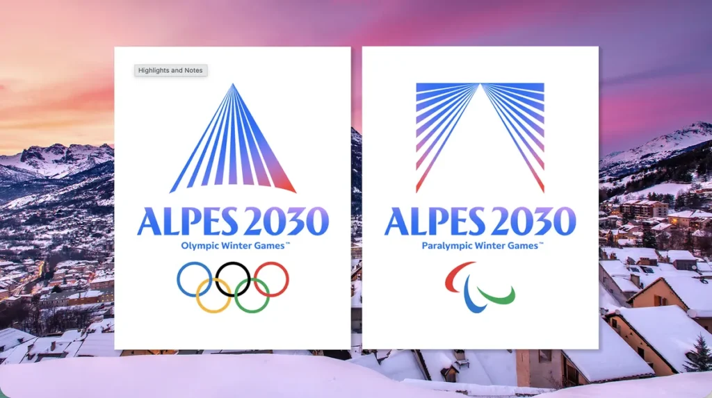
Why Is the 2030 Winter Olympics Logo So Controversial?
The new logo for the 2030 Winter Olympics has sparked conversations and debates around the world. Some people see it as sleek, modern, and forward-thinking, while others believe it looks more like a banking app than the identity of one of the world’s largest sporting events.
While reactions have been mixed, this isn’t unusual. Many logo redesigns receive criticism when they’re first introduced. Initial impressions often focus on aesthetics rather than the strategy behind the design, but a successful logo is about much more than whether people immediately like how it looks.
What the Logo Actually Represents
The creators of the logo say it is inspired by “a mountain revealed by light,” with the lines representing the Alpine mountain landscape. Blue and pink lines stretching across the design symbolize a sunrise or sunset over the Alps, while the two points coming together represent the Olympic values of unity, ambition, and bringing people together.
Rather than relying on traditional winter sports imagery like snowflakes or skiers, the design takes a more modern and symbolic approach. It reflects not only the location of the Games but also the spirit and emotion behind them.
Why the Criticism Misses the Point
Like many brands, the first impression of a new logo can cause debate and controversy. However, those initial reactions do not determine whether the branding is successful.
The new logo is modern and minimal, which is exactly what allows it to work across today’s digital landscape. Unlike logos designed decades ago, today’s identities must function across websites, mobile apps, social media, broadcast graphics, merchandise, etc. A clean, simple design is often more recognizable and versatile than a highly detailed one.
Many of today’s most recognizable brands such as Nike, Apple, Airbnb, and Mastercard, use minimalist identities because they are easier to recognize and more adaptable across platforms. Simplicity isn’t a shortcut, it is the result of thoughtful strategy.
Why a Logo Isn’t Your Brand
One of the biggest misconceptions businesses make is believing that a logo creates a brand. In reality, a logo is only one part of a much larger brand identity.
A brand is built through positioning, messaging, customer experience, leadership, company culture, and consistency. The logo serves as the visual representation of that strategy not the strategy itself.
This is something we see often. Companies can spend months debating colors, icons, and fonts while giving far less attention to the questions that matter most: What makes us different? Who are we trying to reach? Why should customers choose us over the competition?
The strongest visual logos don’t come first; they follow a clearly defined brand strategy.
Lessons Every Business Can Learn from the Olympics Rebrand
Whether you love the new logo or not, there are valuable lessons every business can take away from its launch.
First, expect change to generate conversation. Even some of the world’s most recognizable brands faced criticism when introducing new identities, only to become iconic over time.
Second, design for versatility. Today’s logos need to perform just as well on a smartphone screen as they do on a billboard, presentation, or piece of merchandise.
Finally, remember that branding is about far more than a logo. A successful brand combines strategy, messaging, visual identity, and customer experience into one consistent story. Without that foundation, even the most beautiful logo won’t create lasting recognition.
Whether people love or dislike the 2030 Winter Olympics logo today isn’t the most important question. The better question is whether it creates a flexible, recognizable identity capable of representing one of the world’s biggest sporting events across every platform for years to come.
For founders, CEOs, and marketers, that’s the real lesson. Branding isn’t about creating a logo everyone agrees on the day it launches. It’s about building an identity that communicates your purpose, supports your strategy, and stands the test of time.